What makes a good food photograph?


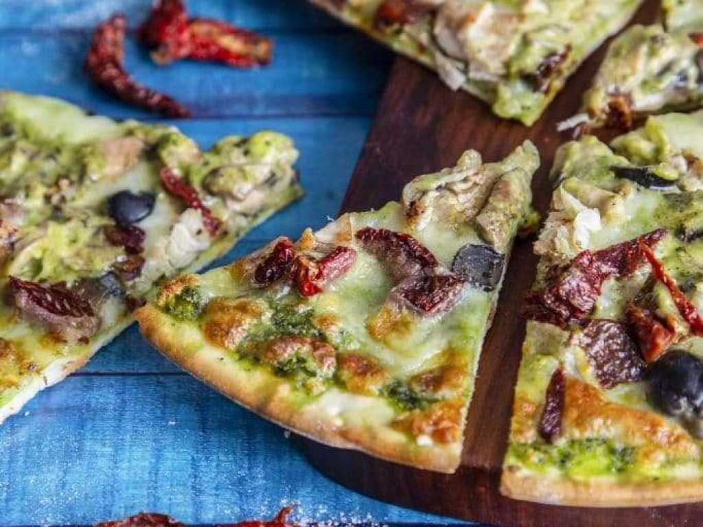
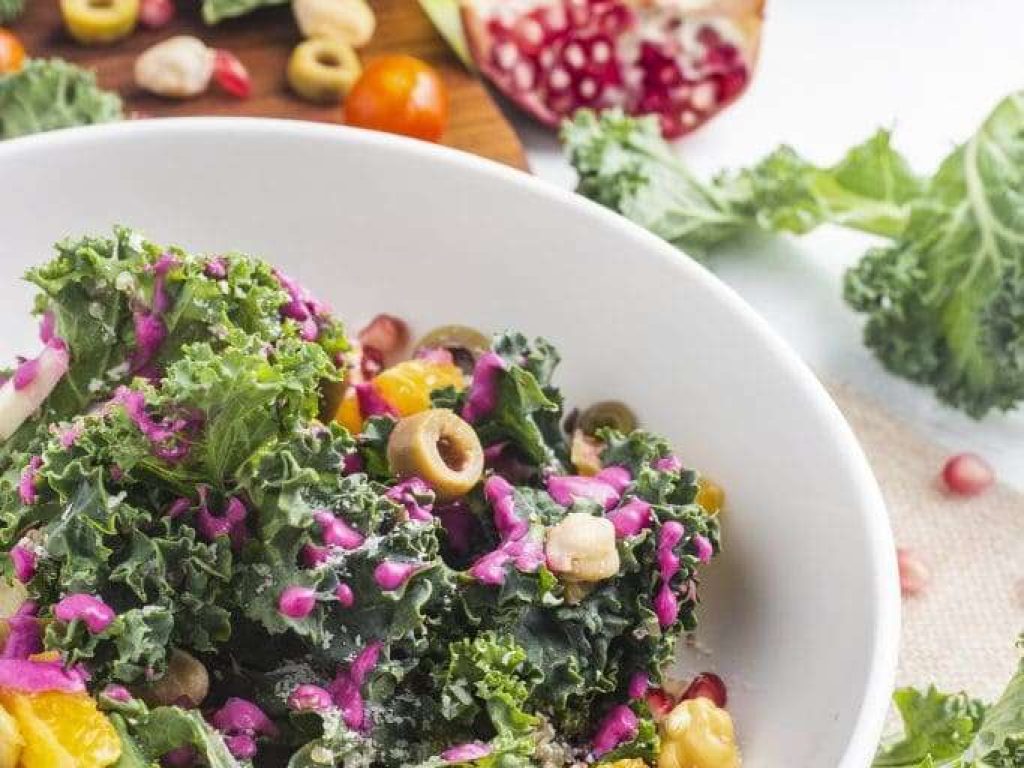
Food photographs often make food photography look easy! I mean, what’s to it? You point at the food and shoot right? It’s not moving. The light should be steady in most cases. So why ask the question at all?
What makes a good food photo?
Maybe we should first ask “What makes a BAD food photograph?”
Here’s a little list, and you’ll probably recognise some of these points from budget restaurants, take-aways and places where the owner obviously doesn’t want to invest a cent more than he or she has to!
- over-saturated colour – yuk!!!
- badly composed photograph – in essence it just doesn’t tell a story, it’s just a photo and it’s not quite right!
- poor ‘depth of field’: this is often where the photographer wants to blur some of the background, but ends up blurring too much, and the food itself has a small amount in focus and a swathe out of focus (for no apparent reason)
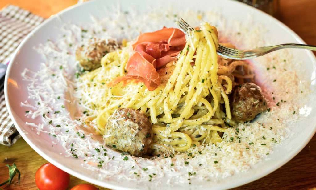
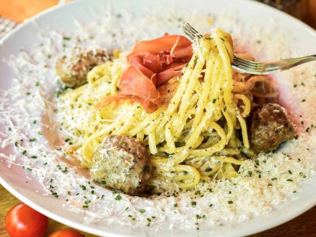
image #1 - spaghetti
The first photo in the above image set was done by a professional photographer and is touted as part of a multi-national’s food photography portfolio. The meal is presented nicely, the table is set well and there’s some interest; but the photo just doesn’t grab me.
I’ve used an example like this very deliberately because there are a small number of large, multi-national photo services entering the market in Australia and New Zealand; selling packages quite cheaply and paying photographers peanuts (I mean basic wage peanuts!). These services often claim they have amazing Artificial Intelligence treatment of photos that’s applied to ALL of the photographs because the photographer just shoots and passes over the images for them to treat. I guess this is meant to make all the images look good and have a similar look.
In this case, there’s a narrow band that’s in focus: about a third of the way up from the bottom of the photograph. It’s too narrow though! I say this because when I look at a plate of food, most of it is in focus. Foreground and background objects are probably a bit blurry, but the food itself either is strongly in focus right where the image grabs me or it’s all in focus. This image doesn’t have the (third of the way up) focal point locking on to a prominent part of the dish. The area that’s in focus should have been larger.
The business that commissioned and paid the multi-national for this set of photographs has been given very poor value for money.
image #2 - seafood on green tablecloth
Ignore the tablecloth: the photographer did! More to the point, he deliberately put it out of focus so it didn’t dominate. Good move Craig Kinder! Notice now how your eye is drawn to the mound of food on the plate: that’s because Craig has made it nice and sharp so your eyes go to it first. The drop of from sharp to soft focus is gradual and natural though, unlike the spaghetti photo. So presentation, lighting and composition are all good, and the photographer knows how to drive his camera!
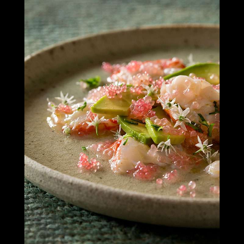
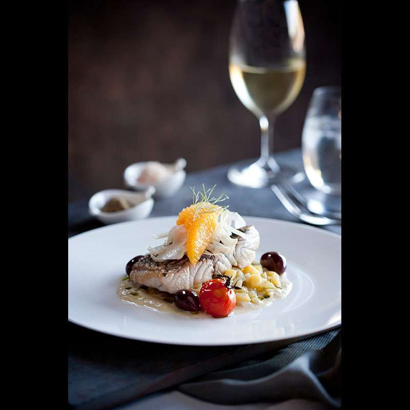
image #3 - some sharp seafood!
Where do your eyes go here? Bang on the delicious, beautifully presented food! And guess what? It’s beautifully in focus, with the salt and pepper, cutlery and glasses nice and soft in the background. Perfecto! Because your eyes go to the food first, then they take in the rest of the scene. This is a really, really good photograph.
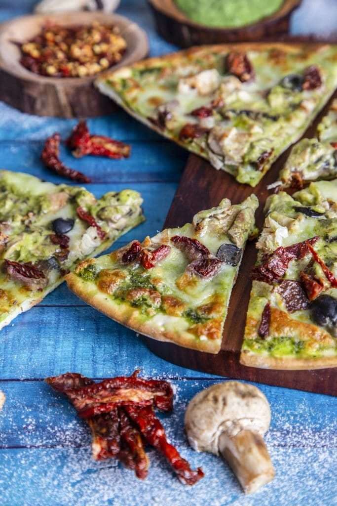
image #4 - a slice of heaven
How do you eat a pizza? One slice at a time; and that’s why this image from expertphotography.com is good. It focusses on what you want: your first slice! It’s there; waiting for you. Go on! Take it 🙂 If the pizza were whole, I’d expect the majority of it to be nice and sharp; but presented as it is, this is good photography.
You mostly get the photographs you pay for
In the end, these multi-nationals will get some market share; but over time people will come to know they do a poor job. If you want good photography, go to a reputable photographer who can show you shots he or she has taken and developed themselves! That happens to be the only way you can be confident they can do the same for you!


