How to decide what to put at the top of your webpage

People often wonder what to put on their web page, and it’s a legitimate question; but it’s hooked into a larger question that I’m going to cover by answering by the question “How do I decide what to put at the top of my web page?”.

That may be a new thought to you, but it’s really important, because that’s what people see first. And my answer: “It depends on the purpose of the page!”.

“That’s cheeky!”, you may think, but read on…

One kind of web page is a “landing page” – one that’s been built specially for you to land on after clicking on a link from somewhere else; but I’m not going to cover that today.

Let’s talk about a regular page in your website that people may come cold in to. This could be your home page or another page in your website, most likely found via your website menu.

Here’s a concept: it's like opening a letter.

When we open a letter that’s folded into an envelope, we’ll often see a third of an A4 sheet before we unfold it. Smart marketers will always fold the letter so you see the top of the printed page when you pull it from the envelope (instead of the back of the page). In marketing terminology, this region is known as “above the fold”. It’s what you see before the rest of the letter, and there’s a parallel in websites; in that when we view a pages, there is some content visible on the monitor, and some not visible which can be scrolled to.

To optimise impact, we should design marketing letters and website pages to have the “above the fold” area contain strategic, catchy content. What that content is, is up to your marketing strategy (more on that later).

We now live with desktop, Tablet and Mobile devices

But there’s a spanner in the works!

Life in this regard has unfortunately become more complex with the advent of computer tablets and mobile phones, because the fold point changes with changes in screen size and orientation (portrait/landscape). 

decisions, decisions...

Decisions on what to say and where in your page to say it need to be implemented for desktops, tablets and phones, so using a ‘responsive website builder’ is essential. Being able to design for tablets and phones is also essential. And upstream from writing the actual page, the ability to plan the page in terms of content blocks, and prioritise the blocks for different kinds of displays is essential.

Let give one example: one of the pages in my www.fourfootfotos.com website has a section that’s broken into 3 columns when viewed on my desktop computer. There’s a graphic in the left and right column, and text in the middle. When displayed on a phone, it’s all too compressed, and the text column becomes really deep and skinny.  Here’s the original layout I did for desktop devices. You can imagine what it would be like all squashed up!

a snapshot of a webpage as designed for a desktop device

i had two options

Rather than leave it this way, I had to options:

  1. Put the graphics above and below the text, so they all used full width on the phone
  2. Remove one of the graphics so there were only two columns.
  3. A third option is a hybrid: remove one of the graphics and let the remaining text and images columns stack so they both got full width.

In this situation, I decided to simply stack the areas one on top of the other for both tablets and mobiles. I could have chosen to skip one of the images and do two columns, with text in one and an image in the other for the tablet devices though.

The Content Management System you use (Joomla, WordPress, SquareSpace or even Wix) will determine which options you have in this regard. That’s partly driven by the framework employed by the website system; whether it’s built on breakpoints or a grid system. That is a deeper understanding though, and a topic for another talk.

planning is good!

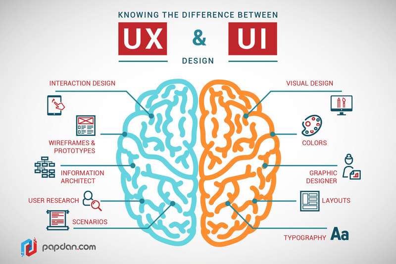
The main thing is that the PLANNING you put into your content structure and blocks, with preferred order and priority per block, will give you the key to making sensible decisions about using the tools you have available in your website system to best achieve your strategic ends per device type. I use an approach called ‘wireframing’. It’s as one of the disciplines of UX Design (User Experience Design). It’s not the sort of thing your average website develop does, because most don’t sit back and think about things strategically, but rather want to pump out the sites with a ‘template’ that fits easily to make money.

ux vs ui 🙂

Knowing the difference between UX (User Experience) and UI (User Interface) design
Image credit: http://www.writingfordesigners.com/?p=19528

Knowing the difference between UX (User Experience) and UI (User Interface) design

Here’s an image from the blog at Mason University called ‘Writing for Designers’. The article is ‘UX Design: The New Frontier). It shows the difference between UI design (as graphic artists do) and UX Design as EX Designers do. Inb short, we tend to look at the why and what before getting to the how of things. We use wireframes and information architecture (among other things) to find the best approach for your website structure. All the graphical treatment happens once the big issues of ‘where the blocks go’, and why, are resolved.

Too much! Not happening!

  • So:
    If your website is not generating the leads you would like
  • If you’re finding your website is too much to think about and you don’t know how to go forward
  • If you’re shooting in the dark (honestly)

Steve Barnes Media, Web & Workflow offers a FREE INITIAL ANALYSIS REPORT of your website!

Just fill out the FREE WEBSITE REPORT form at www.ballaratbusiness.media, and I'll give your website a once over and the resulting report is your, free of charge and obligation. I’ll check the big issues, and make some other observations. Where to from there depends on what you think of what I say.
If you feel you'd rather talk to me about your website, just call me on 0423 311 839 and I'll be happy to field some questions to assist you in finding your way forward.
Websites can be overwhelming, and unless they are planned and written with careful attention to detail, they will likely not produce results. My job is to help you understand your marketing strategy and the drivers for your website so you can methodically go about improving your website until it starts to give results.
At this stage, your website is probably the most valuable marketing asset you have, and it's worth getting it right.